Creating a Real-Time Dashboard from BigQuery Data
Tags: TABULAR, DASHBOARD, PLOTS
Google BigQuery is a cloud-based service for processing very large data sets. It is a serverless and highly scalable data warehousing solution that enables users to analyze data using SQL-like queries.
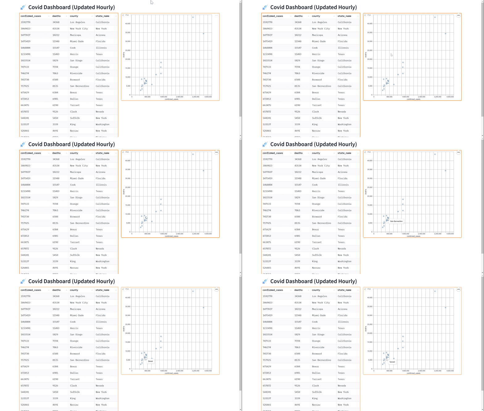
In this tutorial, we will show you how to query a BigQuery dataset in Python and display the data in a dashboard that updates in real time using gradio. The dashboard will look like this:

We'll cover the following steps in this Guide:
- Setting up your BigQuery credentials
- Using the BigQuery client
- Building the real-time dashboard (in just 7 lines of Python)
We'll be working with the New York Times' COVID dataset that is available as a public dataset on BigQuery. The dataset, named covid19_nyt.us_counties contains the latest information about the number of confirmed cases and deaths from COVID across US counties.
Prerequisites: This Guide uses Gradio Blocks, so make your are familiar with the Blocks class.
Setting up your BigQuery Credentials
To use Gradio with BigQuery, you will need to obtain your BigQuery credentials and use them with the BigQuery Python client. If you already have BigQuery credentials (as a .json file), you can skip this section. If not, you can do this for free in just a couple of minutes.
First, log in to your Google Cloud account and go to the Google Cloud Console (https://console.cloud.google.com/)
In the Cloud Console, click on the hamburger menu in the top-left corner and select "APIs & Services" from the menu. If you do not have an existing project, you will need to create one.
Then, click the "+ Enabled APIs & services" button, which allows you to enable specific services for your project. Search for "BigQuery API", click on it, and click the "Enable" button. If you see the "Manage" button, then the BigQuery is already enabled, and you're all set.
In the APIs & Services menu, click on the "Credentials" tab and then click on the "Create credentials" button.
In the "Create credentials" dialog, select "Service account key" as the type of credentials to create, and give it a name. Also grant the service account permissions by giving it a role such as "BigQuery User", which will allow you to run queries.
After selecting the service account, select the "JSON" key type and then click on the "Create" button. This will download the JSON key file containing your credentials to your computer. It will look something like this:
{
    "type": "service_account",
    "project_id": "your project",
    "private_key_id": "your private key id",
    "private_key": "private key",
    "client_email": "email",
    "client_id": "client id",
    "auth_uri": "https://accounts.google.com/o/oauth2/auth",
    "token_uri": "https://accounts.google.com/o/oauth2/token",
    "auth_provider_x509_cert_url": "https://www.googleapis.com/oauth2/v1/certs",
    "client_x509_cert_url": "https://www.googleapis.com/robot/v1/metadata/x509/email_id"
}
Using the BigQuery Client
Once you have the credentials, you will need to use the BigQuery Python client to authenticate using your credentials. To do this, you will need to install the BigQuery Python client by running the following command in the terminal:
pip install google-cloud-bigquery[pandas]
You'll notice that we've installed the pandas add-on, which will be helpful for processing the BigQuery dataset as a pandas dataframe. Once the client is installed, you can authenticate using your credentials by running the following code:
from google.cloud import bigquery

client = bigquery.Client.from_service_account_json("path/to/key.json")
With your credentials authenticated, you can now use the BigQuery Python client to interact with your BigQuery datasets.
Here is an example of a function which queries the covid19_nyt.us_counties dataset in BigQuery to show the top 20 counties with the most confirmed cases as of the current day:
import numpy as np

QUERY = (
    'SELECT * FROM `bigquery-public-data.covid19_nyt.us_counties` '
    'ORDER BY date DESC,confirmed_cases DESC '
    'LIMIT 20')

def run_query():
    query_job = client.query(QUERY)
    query_result = query_job.result()
    df = query_result.to_dataframe()
    # Select a subset of columns
    df = df[["confirmed_cases", "deaths", "county", "state_name"]]
    # Convert numeric columns to standard numpy types
    df = df.astype({"deaths": np.int64, "confirmed_cases": np.int64})
    return df
Building the Real-Time Dashboard
Once you have a function to query the data, you can use the gr.DataFrame component from the Gradio library to display the results in a tabular format. This is a useful way to inspect the data and make sure that it has been queried correctly.
Here is an example of how to use the gr.DataFrame component to display the results. By passing in the run_query function to gr.DataFrame, we instruct Gradio to run the function as soon as the page loads and show the results. In addition, you also pass in the keyword every to tell the dashboard to refresh every hour (60*60 seconds).
import gradio as gr

with gr.Blocks() as demo:
    gr.DataFrame(run_query, every=gr.Timer(60*60))

demo.launch()
Perhaps you'd like to add a visualization to our dashboard. You can use the gr.ScatterPlot() component to visualize the data in a scatter plot. This allows you to see the relationship between different variables such as case count and case deaths in the dataset and can be useful for exploring the data and gaining insights. Again, we can do this in real-time
by passing in the every parameter.
Here is a complete example showing how to use the gr.ScatterPlot to visualize in addition to displaying data with the gr.DataFrame
import gradio as gr

with gr.Blocks() as demo:
    gr.Markdown("# 💉 Covid Dashboard (Updated Hourly)")
    with gr.Row():
        gr.DataFrame(run_query, every=gr.Timer(60*60))
        gr.ScatterPlot(run_query, every=gr.Timer(60*60), x="confirmed_cases",
                        y="deaths", tooltip="county", width=500, height=500)

demo.queue().launch()  # Run the demo with queuing enabled